
What do the last few general elections really tell us about support for the Labour and Conservative parties?
It is strange to look back on recent years in British politics – filled with talk of hung parliaments, possible (and actual) coalition configurations, the impact and influence of ‘third’ parties, the decline of the two-party system, voter dealignment, and growing public scepticism and disengagement over the central features of the political establishment – and realise that the two biggest parties in the UK have actually had their level of support stabilise, and indeed slightly grow, over the last decade or so.
One of the biggest long-term stories in British politics is that of declining support for the two largest parties. Aside from some particularly anomalous phases in the last 100 years of UK democracy – for example, the period in the early 20th Century where the Liberal party tore itself apart and was dramatically overtaken by Labour as a tenable party of government, or the moment in 1983 where Labour, challenged by internal divisions, surrendered enough support to the nascent SDP/Liberals to see that alliance win more than a quarter of the popular vote – the combined support for the two parties with realistic prospects of gaining commons majorities has never been lower.
Fascinatingly, however, it seems that this is a trend that was reversed in the 2015 general election – and, on further investigation, declining support for the two largest parties may have already levelled-out, or even started to recover, as far back as 2005.
I threw together the two graphs below – based on easily available vote share and turnout data – for a lecture I gave on Monday. They show the combined Labour and Conservative vote share in general elections since 1931 and their combined share of the electorate (that is, their share of everyone eligible to vote) respectively.

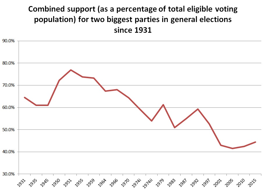
These graphs make the general direction of travel quite clear. Support reserved for the two largest Westminster parties fell dramatically over the course of the 20th Century. This is a well-discussed feature of the contemporary British political landscape – see, for example, David Denver’s compelling ‘dealignment’ explanation for the deteriorating connection between particular kinds of voters and specific political parties.
What might be unexpected here, however, is that 2015 also saw a slight uptick in the vote share of the two biggest parties – this, in an election marked more than ever by the rise and recognition of ‘third’ parties, and the multi-party campaigning brought about by them. Despite the increased profiles of UKIP, Plaid, the SNP and the Green Party, it seems as if the declining fortunes of the Liberal Democrats was enough to contradict the general trend of dealignment from the two biggest parties.
But the Lib Dem collapse alone cannot explain how, taking into account not only the voting electorate but the level of support achieved by parties as a share of the entire population of eligible voters, the dealignment trend appears to have been stabilised by 2005 and reversed in both 2010 and 2015. The idea that the aggregate level of support enjoyed by Labour and the Conservatives actually slightly improved in 2010 seems to contradict every major narrative about that election, marked as it was by the Liberal Democrats’ acquisition of around a million new voters after a successful election campaign and the subsequent hung parliament and coalition negotiations.
So why aren’t we talking very much about the stabilisation (or even the improvement) of the vote share enjoyed by the two biggest parties? At least part of the answer lies with the deceptive nature of the 2001 general election, Blair’s second huge electoral success. While the vote share of the two biggest parties declined by less than 2% between 1997 and 2001, their share of the entire eligible voting population crashed by almost 10%, placing the combined electoral support base for the two biggest parties below 50% for the first time: where they have stayed ever since.
Our tendency to focus on vote share rather than electorate share – which takes into account fluctuations in voter turnout – made 2001 seem like a relatively good year for the managed decline of two-party politics in the UK rather than a stunning decline in support: a steeper drop than those recorded between 1992 and 1997 and between 1979 and 1983, when the rise of the SDP caused so much trouble for the then-established two-party norm.
From the electorate share, we can see that the 2010 and 2015 elections represent something quite unusual in recent political history. These are the first two consecutive general elections to show an improvement in the electorate share of the two biggest parties since 1987 and 1992, when Labour’s fortunes slowly recovered and the nascent Lib Dems, confounded by the UK’s electoral system, incrementally lost the high vote share enjoyed by the Alliance in 1983. 2010-2015, 1987-1992 and 1950-1951 are the only three occasions since 1931 showing two consecutive elections of growing electorate share for the two biggest parties.
It’s too soon to tell whether the combined vote and electorate share of Labour and the Conservatives will continue to grow in future general elections. These graphs show that the general trend of declining support has been interrupted before, and sometimes more significantly, than in recent years. And even if overall support for the two biggest parties is set to continue rising in the coming years, there’s no escaping the brute fact that it currently still sits at a nearly historic low point, with less than half of the electorate endorsing one or the other of Labour or the Conservatives.
However, there is enough here to at least begin to argue that the haemorrhage of support from the two biggest parties has now been halted – and to develop a set of possible explanations as to why this could be the case in an era of chaotic and dealigned politics. Rumours of the death of two-party politics may yet prove to have been greatly exaggerated.

